Every now and then we get asked this question. Especially now, after this article on Tnooz was published.
Ever since social media and smartphone use became a frequent daily activity in mosts peoples lives (circa 2010), there have been several attempts (by Google, HERE, Hipmunk, HRS, Sightsmap, ourselves, and probably some others too) to data mine public social media, create area ratings and visualize them as heat maps of Areas of Interest.

For us, from the very beginning the main goal has been achieving accurate global coverage. Collating geo-spatial data is not a trivial issue and it’s a challenge even for giants like Apple. No one (not even Google) is 100% accurate with geo-spatial data. However, a high degree of accuracy is desirable when offering a useful map service. Otherwise one risks misleading users and sending them the wrong way. A map that points you in the wrong direction is useless and in the worst case it may even ruin your travel experience.
That’s why, although we started working on this in 2011, we released the trial version of our global service product only in 2014, despite being aware of others working on similar solutions.
We believe that in the end what really matters is not the novelty of a concept, but the real value a quality product delivers to its users. Google (search), Facebook (social network), iPad (tablet) – none of them were the first of their kind, but they made a great difference by providing the best product to their users.
Now let’s go back to GeoPopularity Scores: at first glance it may not look like a big deal, just similar looking heat maps. Right? Not really.
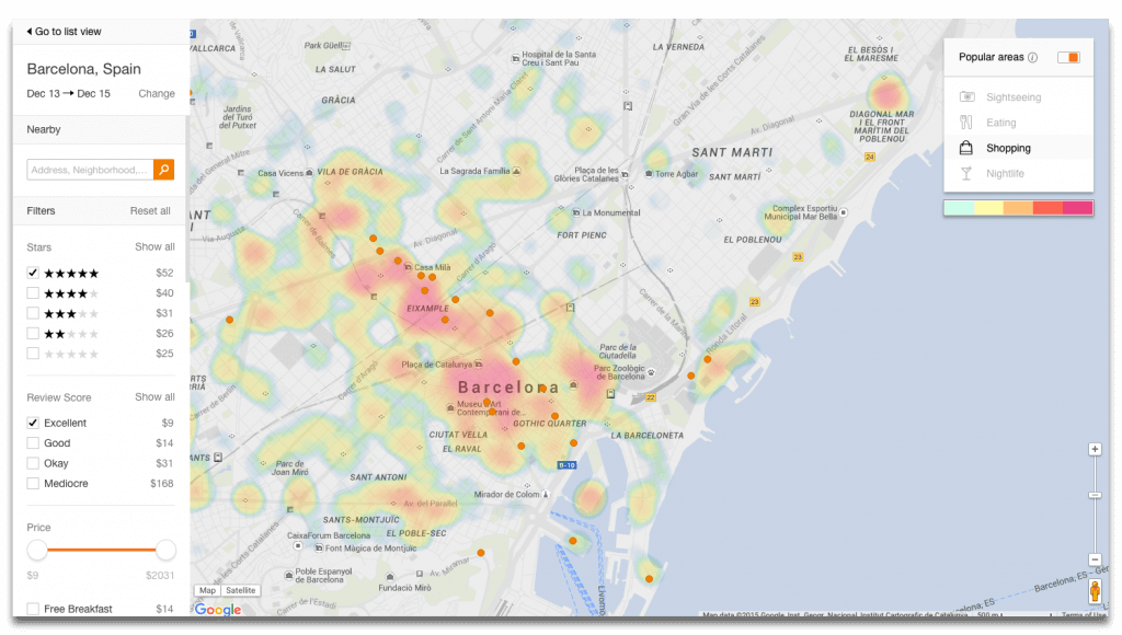
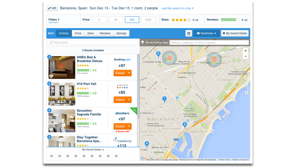
Here are some comparison screenshots:


Imagine a short weekend trip to a new city, where you plan to do some shopping (dining, partying), but you book a hotel in the wrong part of town. It means wasting your limited time on commutes, extra travel costs and the inconvenience of not being able to change your city activity plans quickly. What’s the value of making sure that doesn’t happen?
Upon zooming in, you will also notice another difference – our maps show popular hotspots in much more detail, all the way down to a street corner level – so you can see if there are any hotspots just around the corner, or several blocks away from your hotel.

To achieve what we believe to be acceptable accuracy, we’ve analyzed over 100 million pre-filtered geo-tagged photos (and counting), billions of checkins, likes, reviews, ratings, media articles and location data from multiple sources. Our algorithms work similar to Google’s PageRank, but instead of indexing web pages, they index places by analyzing large amounts of user generated signals containing geo-coordinates.
The process is rather complex – each country is geo-fenced and we assign a value weight to each data source according to its geography (for example, in some areas of the world regional sites are more used than global sites), then each “signal” (photo, like, comment, rating, check-in etc) from each source is assigned a different value. Then the total of scores for a location is cross-referenced with similar venues at a local cluster level, then area and city levels. There’s also some value pondering processes based on city sizes. To provide the resulting information in an easy to digest manner, different algorithms are required to visualize the heat maps according to each map zoom level.
Another important aspect is the management of sources. As new sources emerge, some become more relevant and some may become outdated. We are updating, evaluating, and adding sources weekly. Three months ago we were working with 30+ sources, now with 50+ and will continue adding more each month. All of this to ensure the best possible accuracy and coverage.
Last, but not least, there are issues related to seasonality, product updates, scalability and performance, but that’s a topic for another post :)