There’s many reasons why Booking.com has been the top global OTA for almost two decades now. One of them is mastering some of the best user experience (UX) on the market.
It is well known that the product teams at Booking perform regular A/B tests of every user interface (UI) element to keep improving and optimizing results. There’s no random UI elements on their site. As a result they have arguably one of the highest conversion rates in the industry.
In this review we’ll focus on how they leverage the lesser-known elements of Location Context (helpful location information that allows users to evaluate the location of a hotel) to enhance the UX across the booking journey.
Why Location Context? Because of 3 really good reasons:
- Location is one of the main criteria when booking accommodation – from the moment a destination is chosen to the moment of booking – location conveniency plays a huge role.
- Location Context is still one of the most poorly understood and underdevelopedUX elements by most product managers of OTA and Metasearch companies.
- At AVUXI we specialize in Location Context for Travel, allowing us to notice details that may go unnoticed by others.
First, Some Context
When planning a recent bleisure trip to Fuengirola in Spain, a city which we never visited before, the question came up: Where to stay at?

Despite a variety of good hotel suggestions from a local friend, we had no clear idea about which to choose from the many options available.
Hotel quality was important (within a reasonable price), but even more important was maximizing the overall experience and not wasting our limited time in town on commutes.
Why Booking.com?
Simply because they provide more hotel location context than most OTAs, which is very helpful when looking for a hotel in an unfamiliar destination.
So we decided to use the opportunity of taking Step-by-Step screenshots and record our observations as an actual user doing the hotel search and reservation.
Here’s What Booking Did Well — in 5 Steps
After typing in the destination city and the travel dates, we get to the Search Results Page:
1. Search Results Page — Highlighting Proximity and Relevance
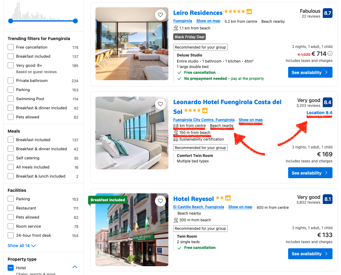
The UI structure of the search results page is nowadays pretty similar across most OTAs. However, Booking.com also displays very useful location context for each accommodation:
- “Location 9.4” Score: A numerical location score (9.4) is prominently displayed alongside the rating of the property. This score reflects the aggregated guest satisfaction with the property’s location. Travelers get a clear, at-a-glance indication of location quality, reducing decision-making friction.
- “Show on map” Link: This makes it easy for users to quickly access and visualize the location of the property on a map, adding transparency and convenience to the search process.
- Proximity Information: Key phrases such as “0.6 km from center” and “150 m from beach” provide users with immediate, precise proximity details. These details cater to specific traveler needs — such as staying close to central locations or beaches — without requiring additional clicks.
- “Beach Nearby” Tag: A supplementary phrase like “Beach nearby” enhances the numerical proximity data by adding qualitative value and attractiveness to the location, emphasizing relevance to leisure travelers.
Impact:
These features work together to simplify search comparisons. Users can evaluate the suitability of a location directly from the results without opening property pages.
2. Interactive Map — Adding Spatial Awareness
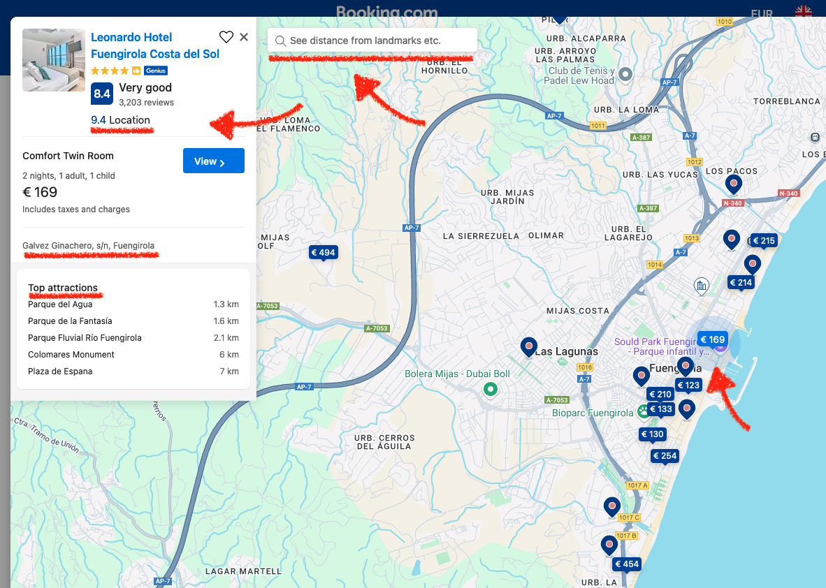
The map view functionality deepens the role of location context by facilitating a visual understanding with a geographical overview of the search results:
- Search Distance from Landmarks: The ability to “See distance from landmarks, etc.” provides a customizable way for users to understand location relevance based on personal priorities.
- Location Score with Property Details: Clicking on a property highlights the location score (“9.4 Location”), reiterating the property’s quality in relation to its surroundings.
- Nearby Attractions: Key attractions such as “Parque del Agua (1.3 km)” are listed in the map details, offering quick insights into what’s accessible from the property.
- Price Pins on the Map: Users can see property prices pinned directly on the map, which allows them to compare both location and affordability spatially. For example, properties along the coastline or near the city center can be evaluated simultaneously for cost and their proximity to the desired areas.
Impact:
The map interface acts as an interactive layer of location context, enabling users to visualize and explore their accommodation’s spatial relation to the destination’s highlights.
3. Property Details Page — Storytelling Through Location
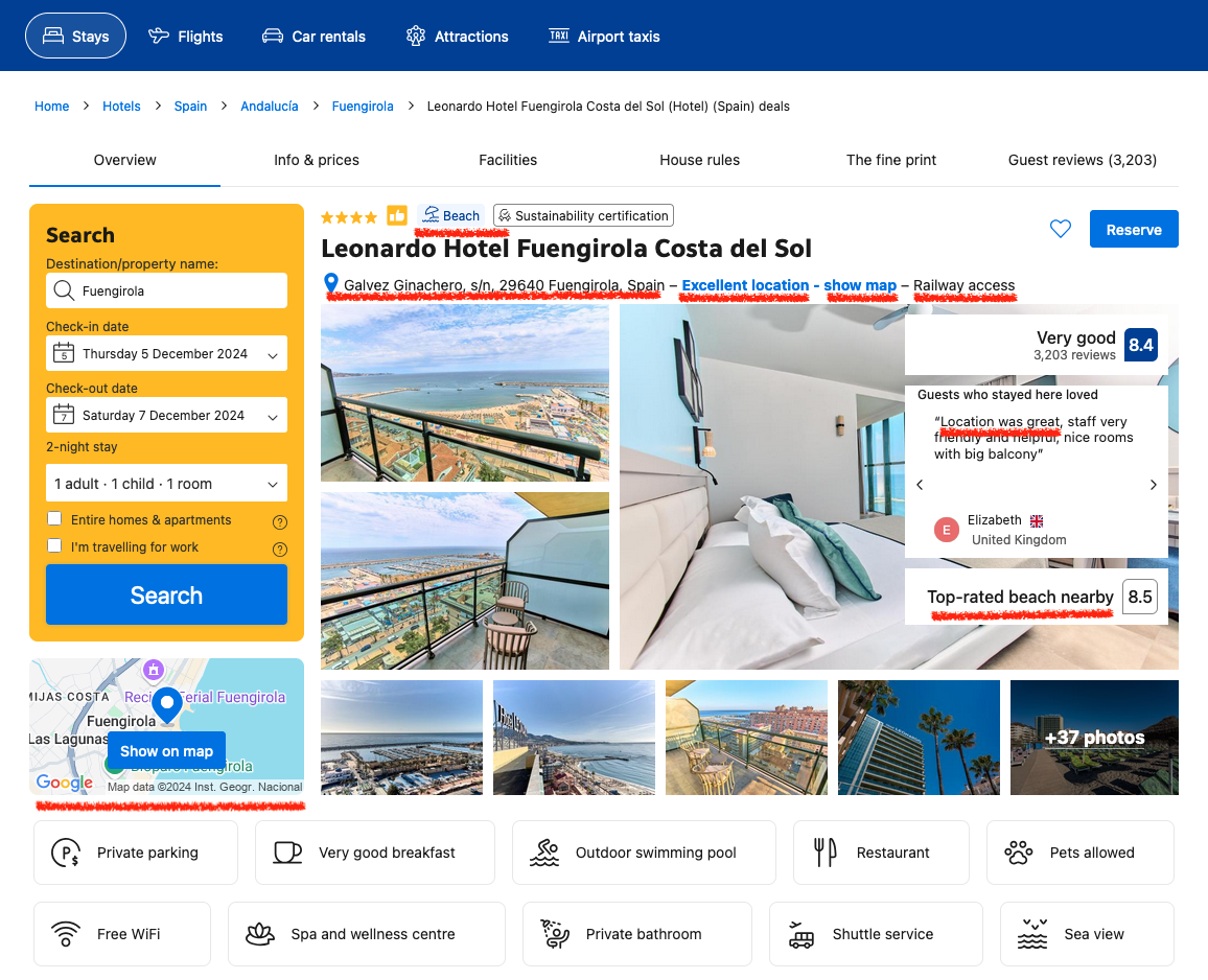
Booking.com amplifies location context on the property details page by making it an integral part of the guest experience narrative:
- “Excellent Location” Tag: Location quality is reinforced through qualitative phrases like “Excellent location,” which align with the numerical scores and user reviews.
- Proximity Highlights: Specific phrases such as “150 m from beach” and the listing of nearby landmarks enhance clarity on what makes the location appealing.
- Guest Feedback on Location: Highlighted review snippets, such as “Guests who stayed here loved the location,” add authentic, user-validated information about the area. Phrases like “Location was great, staff very friendly and helpful, nice rooms with big balcony” create a relatable narrative.
Impact:
This information reassures users of the property’s suitability for their travel preferences, combining numerical scores, qualitative descriptions, and authentic user opinions.
4. Hotel Surroundings — Relevant Location Details
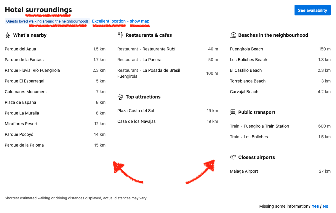
Location context is amplified even further with more details in a lower section the same page, as a reassuring part of the UX narrative:
- Neighborhood Reviews: Highlighting statements like “Guests loved walking around the neighborhood” and “Excellent location” reinforces the appeal of the property’s location.
- Categorized Location Details: Nearby landmarks, restaurants, and beaches are organized into distinct categories, catering to different traveler intents, such as:
Beaches: “Fuengirola Beach – 150 m.”
Public Transport: “Fuengirola Train Station – 600 m.”
This categorization helps users evaluate multiple aspects of convenience, such as transport access and leisure activities.
Precise distances (e.g., “1.5 km” for Parque del Agua) provide concrete expectations about accessibility.
Impact:
Highlighting the attractive aspects and organizing proximity data into categories makes it easier for users to assess the practical benefits of the property’s location.
5. Guest Reviews — Authentic Insights into Location
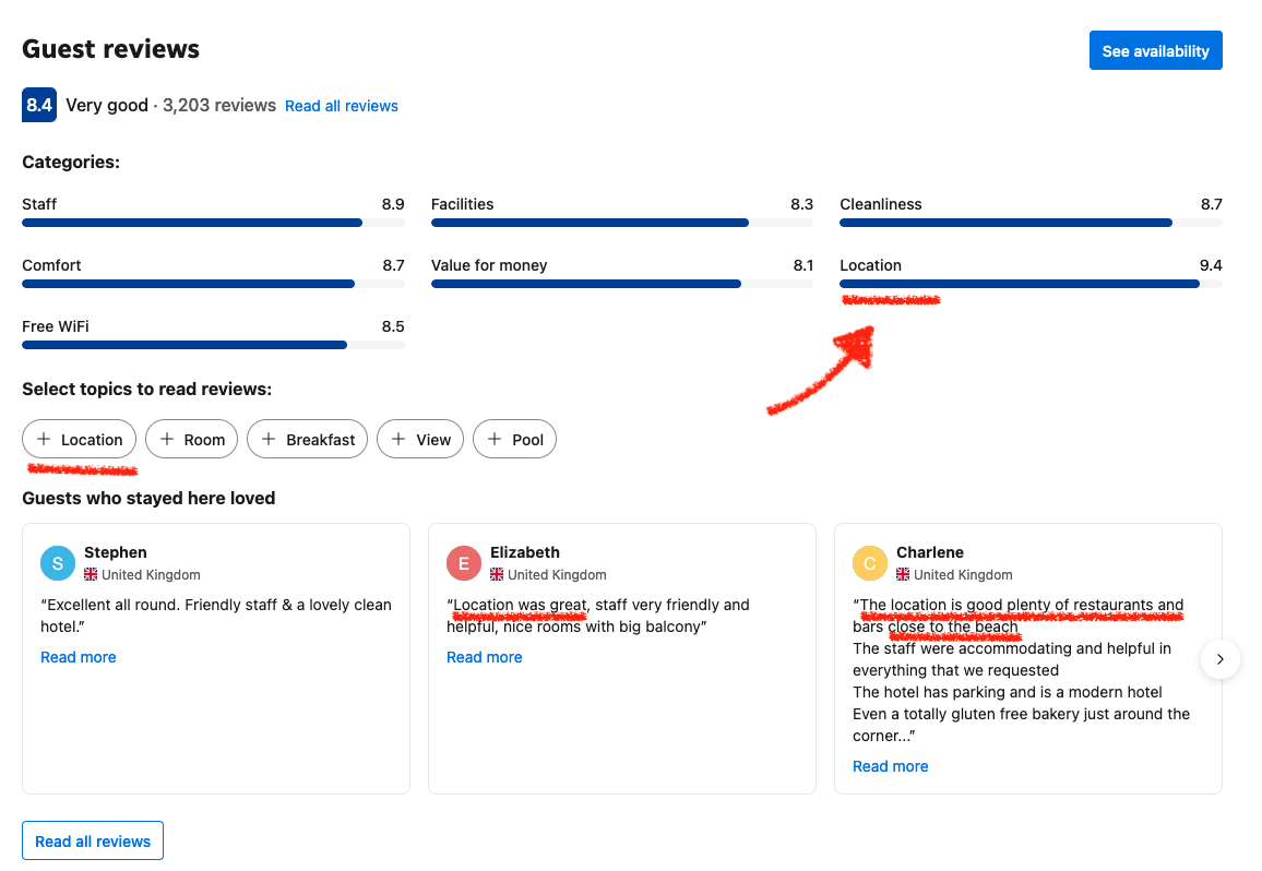
Location is once again a criteria used to highlight and filter guest reviews.
On average 7 out of 10 guest reviews start by mentioning the hotel location.
Location-specific reviews help address travelers’ concerns by adding a human touch to the location context:
- Location Review Category: A dedicated score and category for “Location” in the reviews section gives the users a focused overview as well as quick access to more detailed feedback.
- Positive Guest Review Snippets: Review snippets like “Location was great…” and “Plenty of restaurants and bars close to the beach” validate the property’s location attractiveness, providing a relatable and more vivid picture of the area.
Impact:
Location-specific reviews humanize the data, while offering practical insights into what users can expect at the location of their stay.
Key Learnings from Booking.com
Throughout the whole flow, location context evolves dynamically to meet the needs of users at each stage:
- Search Phase: Focus on proximity and easy filtering options.
- Deeper Comparison Phase: Maps and location highlights for a meaningful spatial overview.
- Decision-Making Phase: Detailed descriptions and context to build trust.
Closing Thought
It’s Lines, Not Dots – The Compound Effect of Location Context
Location context is not a single feature — properly leveraged it’s a subtle force that shapes decisions, expectations, and satisfaction. If you only focus on location as a “point” on the map, you miss out on the full potential.
Little details in the right places and moments will create a compound effect. Accommodation booking sites that master the art of “lines, not dots” can create experiences that feel intuitive, personal, and fluid.
When users think, “This place is perfect for me,” it’s often because location context was working quietly in the background. It wasn’t one magic moment; it was a compound effect that started from search and stayed with them until check-in.
Don’t chase silver bullets. Instead, draw the line.
One more thing… here comes our ‘shameless plug’ section:
How Could AVUXI Add Value to Booking.com?
Booking.com already has a robust implementation of location context, but integrating some of AVUXI’s TopPlace Products could enhance it even further:
- TopPlace Heatmaps: Adding visual layers to the maps, showing areas popular for specific interests (e.g., sightseeing, shopping, dining, nightlife) helps users compare and choose faster.
- Detailed Location Scores: Using AVUXI’s automated scoring for categories like shopping, sightseeing, eating and nightlife would provide more granular location insights. A great location for shopping might not be so for nightlife.
- Location Description Summaries: Automatically generate descriptions for the location of each property based on our data-driven algorithms. This reduces the amount of poor location descriptions and removes the need for manual content creation.